
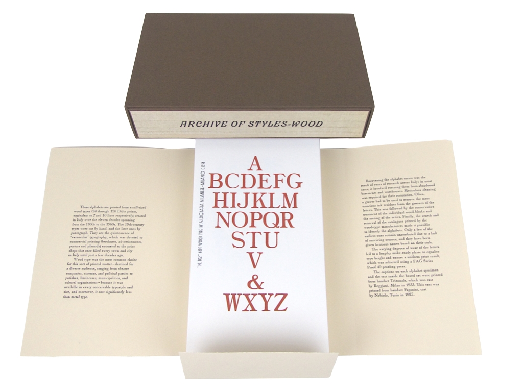


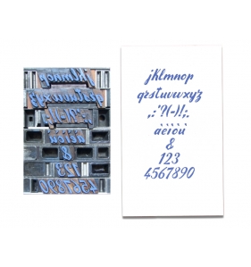
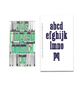
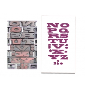
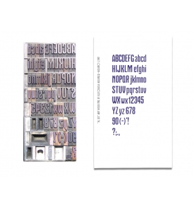
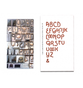
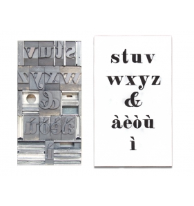
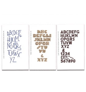
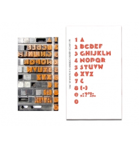
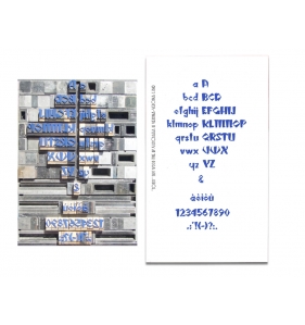
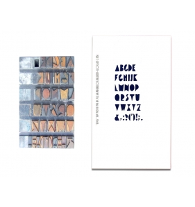
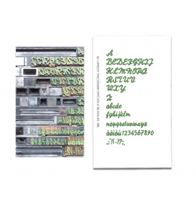
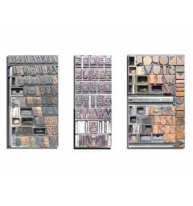
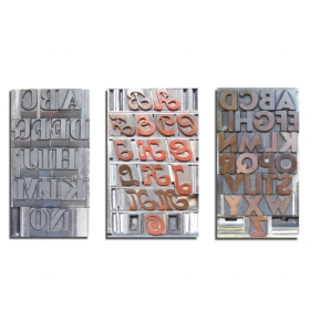
Portfolio of 72 loose prints, each bearing an alphabet in a different style.
This is the third boxed set of the “Archive of Styles - WOOD” series, and it is dedicated to small (up to 10 lines) Italian wood types.
The other two boxed sets are devoted to big (up to 118 lines) and medium (up to 25 lines) Italian wood types, respectively.
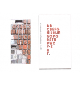
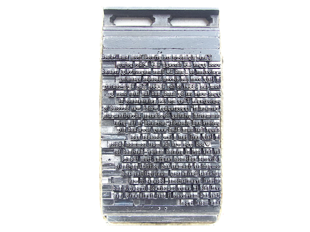
This collection of 72 alphabet specimens are printed from small-sized wood types, created in Italy between the 1860s to the 1960s. The 19th-century types were cut by hand, and the later ones by pantograph. They are the quintessence of ‘vernacular’ typography, which was devoted to commercial printing (brochures, advertisements, posters and placards) entrusted to the print shops that once filled every town and city in Italy.
Print run of 88 copies.
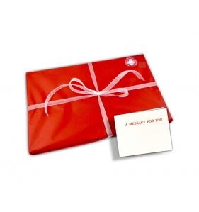
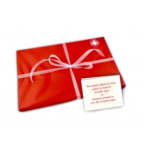
 Complimentary gift wrapping and personalized message for the receiver available at checkout*
(*) no additional charge will be applied

Shipping costs calculated at checkout
This series contains punctuation, letters, and numbers. The type size ranges between 24 and 120 Didot points, equivalent to 2 and 10 lines respectively.
Wood type was the most common choice for this sort of printed matter (brochures, advertisements, posters and placards) — destined for a diverse audience, ranging from theatre companies, cinemas, and political parties to parishes, businesses, municipalities, and cultural organisations — because it was available in every conceivable typestyle and size, and moreover, it cost significantly less than metal type.
This collection includes, for the most part, original typefaces created in-house by wood-type manufacturers. The vast kaleidoscope of forms adopted over the decades encompasses the most heterogeneous array of typestyles. Driven by the influence of Futurism and Modernism, the 1930s and 1940s were exceptionally inventive, and form the largest group overall. In fact, the creation of innovative wood typeface designs peaked during this period.
The breadth and quality of this typographic repertoire reveal a remarkable visual impact – an aspect now highlighted by a flourishing of digital transpositions. Yet, these lack the unique charm of letterpress printing, which lends the printed matter a tangible materiality and expressive force through the physical impression of wood-blocks into the paper.
The alphabet specimens are printed using typographic inks produced between the 1930s and the present day in Italy, Switzerland, France, Germany, Denmark, the Netherlands, and England. Each alphabet is printed with a different colour or shade of colour, creating a chromatic primer of more than seventy distinct shades.
Recovering the alphabet series was the result of years of research across Italy; in most cases, it involved rescuing them from abandoned basements and warehouses. Meticulous cleaning was required for their restoration. Often, a graver had to be used to remove the most tenacious ink residues from the grooves of the letters. This was followed by the conservative treatment of the individual wood-blocks and the sorting of the series. Finally, the search and retrieval of the catalogues printed by the wood-type manufacturers made it possible to identify the alphabets.
Only a few of the earliest ones remain unattributed due to a lack of surviving sources, and they have been given fictitious names based on their style.
The varying degrees of wear of the letters led to a lengthy make-ready phase to equalise type height and ensure a uniform print result, which was achieved using a FAG Swiss Proof 40 proofing press.
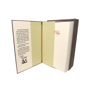
The captions on each alphabet specimen and the text inside the box set were printed from handset Triennale, which was cast by Reggiani, Milan in 1933. The text on the folder was printed from handset Paganini, cast by Nebiolo, Turin in 1927:
The series is housed in a boxed set (16x27x3 cm) whose exteriors were covered with woodgrain paper made in Japan.
These wood types are part of the historical heritage of the Tallone Press (www.archiveofstyles.com).
This edition is a further contribution by the Tallone Press to the field of type design research.
The Press has long dedicated its studies to this discipline; in particular, timeless Apollonian classics were explored in the Manuali Tipografici, while modern, sometimes Dionysian 20th-century types by Italian designers Raffaello Bertieri, Giulio Da Milano, Alessandro Butti, and Aldo Novarese featured in individual publications.
***
Neither monotype nor linotype are used. These typesetting systems from a keyboard are often passed off as manual typography.
The Tallone Press does not print from plastic relief plates either. Derived from digital compositions, they are very much in vogue to simulate the effect of type impression onto the paper.
Printed on very fine paper, this collector’s edition is a sophisticated gift meant to last over time.
Portfolio of 72 loose prints, each bearing an alphabet in a different style.
This is the third boxed set of the “Archive of Styles - WOOD” series, and it is dedicated to small (up to 10 lines) Italian wood types.
The other two boxed sets are devoted to big (up to 118 lines) and medium (up to 25 lines) Italian wood types, respectively.
This collection of 72 alphabet specimens are printed from small-sized wood types, created in Italy between the 1860s to the 1960s. The 19th-century types were cut by hand, and the later ones by pantograph. They are the quintessence of ‘vernacular’ typography, which was devoted to commercial printing (brochures, advertisements, posters and placards) entrusted to the print shops that once filled every town and city in Italy.
Print run of 88 copies.